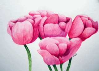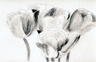
Going back to basics.
I first did a line drawing of tulips. Then I did a value sketch to see where the lights and darks should be. Finally I painted the tulips using the value sketch to tell me where I needed to have highlights and shadows. When I thought I was done I took a picture with my digital camera. I used Adobe Photoshop to make adjustments, but mainly to do a gray scale to see if I needed to add more darks. With the gray scale I noticed that I needed to darken my darks to make the tulip leaves pop.


2 comments:
It was certainly worth all the effort - just beautiful. Those darker values really make the painting.
Thanks Robyn. I'm just finding when I try to experiment, I always seem to get into trouble. So using the value sketch really helps.
Post a Comment